Monday, August 13, 2012

Monica Kubitskey

Landscape Painting

Monica Kubitskey
Day 1:
 Before this class I have never painted outside landscapes against the many degrees and elements that nature can deploy. I never imagined the challenging task it takes to capture the essence of the beauty I viewed in the upcoming days. I was very thankful for the overview of the past, present, and especially the modern twist of artwork that was presented. I was also appreciative of the experience of our professor and her eloquent way of teaching us how to mix, value, shade, compose, and apply the media in our work. 

Day 2 and 3: Carroll Road
Carroll Road 36 x 24 Mixed Media

I planned on using mixed media, and recycled scraps to create the "canvas." I also wanted to add an element of "peek-a-boo" and accentuate the area I felt my eye ws lead to. I wanted to abstract the feature by changing the color, texture, and materials,that made it very difficult to complete this piece. I was very excited about the color and the texture but I noticed that I had not captured the atmosphere and the variations of color all around. The canvas was too large and I felt panicky about the composition and made me question my ability. Thiss is still my favorite piece.

Day 4: Borrows Harbor
Borrows Harbor 20 x 30 Mixed Media

I decided to work a little smaller and try to concentrate on the horizon line "marrying" the colors so that it was more believeable. I found that hatching was a good techinique to blur and break the hard edge. It developed and completed the overall picture of the water , earth, and sky. When I blended the oils too much, it defined shapes and lines of the trees flattening the composition. I wanted to showcase the big, vast sky, like the ones we had viewed.

Day 5: Light House Park
Lighthouse Park 20 x 30 Mixed Media

I used the same hatching technique to try to get the oil on the boards quickly. It seemed to be going very well, but as the heat increased the oil pastels melted all over. My shapes were hard due to the use of blue to begin. Its presense was unable to be eliminated and I had to use the palate knife to scrape through to apply the next color. The distance and compostion needed help with space. Nora showed me how to blur the edges with a rag. It made it appear dreamy and adding lights and darks in large block strokes seemed to help the shadows casted on the rocks. The addition to smaller rocks gave the larger ones weight and grounded the piece. I did work on this longer that evening. This piece had me reevaluate my materials and structure. I went home and concentrateed on perspective drawins using the basics, pencil, charcoal, and chalk. I drew all night and felt refreshed and ready to tak on the next day.

Day 6: Chateau Chantal
Chateau Chantal 18 x 24 Watercolor and Chalk

I feel this was my turning point.I drew with watercolor pencil in one direction of the fields, concentrating on using a view finder to find space, composition, and value shades of color. When I felt the composition was best and acheived the degree of color I stopped so I would not over think and over work the piece. I decided to conquer the opposite side of the the grape vines and rolling hills in pencil. I completed this piece foe homework. I feel these two pieces, although not as exciting, explored the concepts i really wooulfd like to build upon. They were successful in composition, value, and atmospheric space.  

Homework:

I worked each night at the beach with my three kids. While they played, fished and swam, I observed the scenery of two primary places. Good Harbor Beach, a personal favorite, and Shell Beach, the fishing hole.  I used pencil, chalk, and watercolor pencils to produce these. All completed on 18 x 24 heavy weight paper.

Shell Beach 18 x 24 Pencil and Chalk
Shell Beach  18 x 24 Watercolor
Good Harbor Beach 18 x 24 Pencil
Good harbor Beach 18 x 24Chalk
Chateau Chantal 18 x 24 Pencil
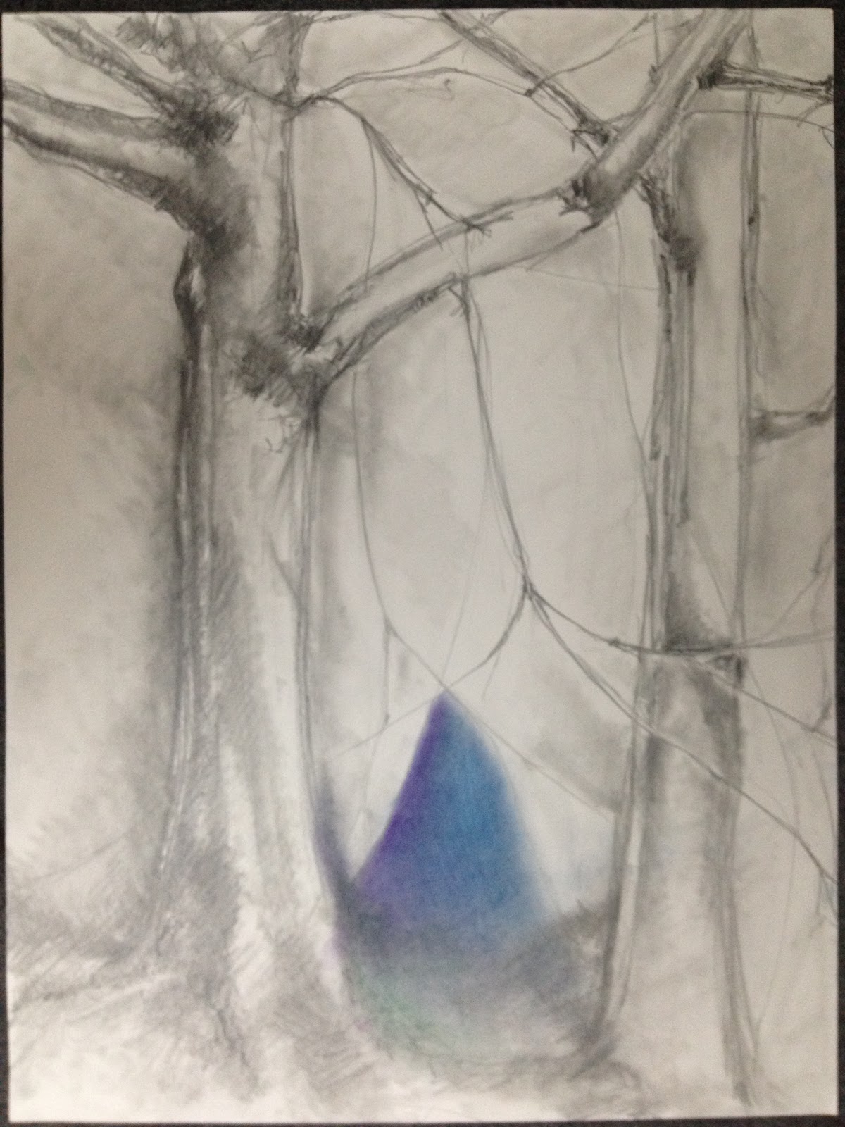
Value study for Carroll Road 9 x 12
Thank you Professor Nora Venturelli. I plan to work extensively on landscapes and incorporate the elements I struggled with in upcoming pieces. I feel tis class forced me out of my comfort zone and developed skills that I will be more aware of in the future. I will create the "locks" but will have an impressive compostion to work with. I will take this class again. See you next summer.
Monica


Friday, August 10, 2012

Sandy Ackerman Landscape Painting 2012
Day 1
I had such a wonderful experience in the 2011 Landscape Painting Class that I was very excited to start again. Seeing all of the slides Nora showed us inspired some new ideas and I felt the need to edit what I was trying to accomplish this week. I decided that the common factor in all of the paintings I admired was the capturing of the light and decided that was going to be one of my goals.

Day 2 and 3
Carroll Road


24 x 30 oil on canvas
I painted this scene last year, but that painting was much less "finished" with a lot of ground showing. The painting from last year is posted on the 2011 blog. I tried to catch the light and also capture the depth and movement toward the back of the canvas. This painting took two morning to complete. After critiques on the second day, I had a discussion with Nora about painting realistically. I guess I was afraid to really go for realism because I thought it was easier to fudge a little and no one would notice lack of skill :D. (I am not talking about photo- realism, those cherry trees are only implied). Still figuring out who I am as a painter!

Day 4
I'm calling this Nora's Hill because she found this spot and this view.
24 x30 oil on canvas
Once again I am trying to catch the morning light and shadows as well as the depth and movement into the distance.The photo is a little dark and there is detail in the front left corner which you can't see very well here. This painting taught me that I need to draw or plan a painting more thoroughly before I paint so that I am not trying to solve perspective issues after I am well into the painting. I left out the road and then had to figure out how to keep distance between front and middle ground believable.With Nora's help, I think it's OK.

Day 5 (I think)
22 x 28 oil on canvas
Bower's Harbor


Still trying to catch some light effects!
It was a dark cloudy day. I wanted to feel like the clouds were coming up over my head in the painting. I played with glazing some light blue from the reflected light on the water onto the bottom of the foreground clouds. I think it really helped them keep their heaviness without being too dark.The red boat and the canoes on shore had to go-too distracting. The photo is dark and loses some detail.How do you light the painting without getting reflections or that glossy shine?

Next Day ( they have all blurred together)
Chateau Chantal
I felt a little brain dead and wanted to try something new so I wouldn't think so hard about it. After getting location advice from Andrea, and brushing in the sky and background, I switched to palette knife.
18 x 24 oil on canvas


I enjoyed the speed of the palette knife and the great textures. I am going to invest in some different sizes of palette knife and use them more often. Nora's suggestion of "chop chop swipe" worked very well.


Homework
                                                   

Each evening, except one (which I blame on my husband), I painted at the East Bay boat launch. I used a very ambitious 48 x 24 canvas and I did not finish the painting while in Traverse City. I have been working on it at home from the photos I took.


It still has a long way to go, but I will post a photo of it when it is finished.

So much is packed into one week, I think it forces you to grow as an artist because you have to solve issues as they come up. You can't put it away and come back to it later. Overall, I learned a lot from everyone. This was such a great group of artists.
I hope everyone continues to post updates. I would love to keep track of how everyone is progressing.

Andrea Rose, Traverse City Blog


     Class started on Saturday afternoon. My initial intentions for my artwork during this class came from a pastel lesson I worked on with my high school students last year where they concentrated on color harmony. I planned on creating work that followed more strict color combinations that belong to triadic, analogous, complementary and tetradic color schemes. I guess I imagined that some of my work would take on a very surreal quality working inside these parameters and I was excited to see how different they would be from other landscapes I have made.
Truth be told, I am really glad I came in with those intentions, but it didn’t produce the work I had envisioned. Instead I helped me focus on color mixing, choosing a strong base and developing shades, shadows and objects with attention to color relationships.
It definitely helped.

Sunday and Monday, Carroll Rd
     The Carroll Rd. painting is important to me because it is not what I wanted to produce but definitely where I needed to start. It has been a while since I’ve ridden this horse and it shows.
 I have found that I am attracted to the layers of a landscape, the colors they produce, the way they meet each other and the shapes the layers create. This piece feels a bit elementary. There are places that read as atmospheric background (top left). In the middle ground the lemon- green grapes vines appear to recede to the right in the center of the work through color and the trees below them have a soft, convincing feeling with their leaves and shadows. In the foreground the poplar tree is identifiable as such, but the stroke is so tight that I’m not sure if it belongs to this painting. On Monday when we came back to this spot I lifted a lot of stipple marks from the back and middle ground that had brought trees and bushes forward during critique. I softened those areas and added the foreground-mowed grasses mixed with flowers.

Photo
"Carroll Rd"                               Watercolor, 15 x 20

     I then started the pastel of the cherry trees and the stick pile. I was attracted to the composition pulling back, the linear rows, and challenged by the mound of sticks. I really wanted to do this using a triad of colors- Blue-violet, yellow-green and red-orange. I guess it was a smart place to begin, but I didn’t stay true to the combination. Instead I worked on pastel technique, laying colors and picking intentional color combinations where areas met, created shapes, and where flowers grew. I struggled with the pile, how to create the texture without it being a floating blob, and with the foreground texture as well.
Homework: Finishing the pastel and rainstorm on the lake.


Photo
"Stick Pile"                                  Pastel, 12 x 18

"Rainstorm on the Lake"      Watercolor, 7 x 15

Tuesday, Bower’s Harbor
     The weather was a bit threatening this day. The clouds filled the sky and shifted form and value as the wind blew. The wind blew hard enough to cause the class to be cold, but I don’t think anyone lost their easels.  I wasn’t interested in the boats. The weather was the star of the show today and the clouds took center stage. Today the scene allowed the watercolor to behave naturally. I was able to be loose with the paint and its application.  I snuck in two little houses that had gotten my attention across the water. They stood out bright against the trees and the dark water.


"Bower's Harbor"                                                                                             Watercolor, 15 x 20

     I also started the pastel of the water’s edge. There is a pull to this composition and there were different areas to play with- the water, where it meets the sand, the grasses and their shadows, and the texture of the trees in the background.
Homework: Finishing the pastel.


"Bower's Edge"                                Pastel, 12 x 18

Wednesday, Old Mission Point 
     The water has receded so far back from the lighthouse that it’s hard to believe the change since the last time I was here. Traverse City had no ripe peaches or delicious cherries. The hot, dry weather really took its toll.
I wanted to paint the rocks that are exposed in the shallow water so I walked quite a ways out to get to a beautiful cluster of them. In the photo I took to document the spot, you can see the triangle of rocks that push back from the bottom right edge of the composition to the back left. I started with painting with a watercolor pencil drawing where I placed in that composition of rocks. I set down a wash and then a combination of base colors under plastic wrap for texture in the rocky foreground.  The painting dictated the direction it wanted to go. I left out nearly all of the individual rocks I had drawn in. Watercolor wants to suggest things when given the chance and I am pleased with the way this piece turned out. Even though there are intentional marks and clearly planned applications of color, this piece is loose in comparison to the first painting.
Homework: State park beach area and a tree. I would like our audience to know that after painting all day in the sun it is pretty difficult to create masterpiece homework assignments! Most of them are studies and this tree lacks any texture even though I attempted it.

Photo

"Old Mission Point"                                                                                                  Watercolor, 11 x 18


"Puddles"                            Watercolor, 4 1/2 x 10 1/2
"Puddles2"    Watercolor, 5 x 7


"Sunset"              Watercolor, 7 x 11


Thursday, Chateau Chantal
     Ahhh the Chateau, a beautiful spot to work at. There are so many angles to view out from here and you can choose any number of subjects and compositions. On my last trip here I painted rows and rows of grape vines and I wanted something different. I chose a spot where two cherry trees had framed rows of shapes and colors all the way out to the water. My work is getting my loose. I am concentrating on the way the layers make shapes and where their points overlap. The colors were stunning even under the early overcast sky. As I worked my way forward, I decided to leave the trees out all together. Even though they were present on both sides of the composition, they would have framed it in a very unnatural way. I wanted to showcase the teal blue grass in the left foreground the amber grasses on the right.
Homework: Mitchell Creek. Entranced by the roots that found the water.

Photo

"Layers at Chateau Chantal"                                                                                                 Watercolor, 11 x 18                           


"Craggy Roots at Mitchell Creek"              Graphite, 9 x 12


Wednesday, August 8, 2012

My Week--Rebecca Arnold

Day 1:

9"x12' watercolor

Since I was a little "rusty" in watercolor, I decided to start off small.  This was by far the most tight & detailed that I worked all week.  I really needed to challenge myself to loosen up.  This was also the beginning of my experience with landscape painting.  Prior to this class I primarily worked on large canvases with acrylics & abstract in style.  I enjoy working with several different medium, so I wanted to concentrate on watercolor for this class.  My goal for the week was to "play" with the watercolor & to find ways for allowing the watercolor to do what watercolors do best.


Day 2:

18"x24" watercolor

On the second day I did loosen up a little bit.  I used much bigger paper & larger brushes.  I really enjoyed working on the rocks.  I was able to use masking fluid & plastic wrap to help gain some rock texture. 

Homework:

 4.5"x6" watercolor on Yupo paper

In the evening I worked on Yupo paper during my homework.  I LOVED this paper!  It definitely forced me to loosen up, but I really enjoyed the simple shapes & the way the colors swirled or blended together!  This "ahh haa" moment changed the direction that I wanted to focus on for the remainder of the week.


Day 3:


18"x24" watercolor

I began my day really struggling!  I felt conflicted on how to incorporate what I so much enjoyed about the Yupo paper.  I started off working on large paper.  After struggling with where I really wanted to go, I decided that working on the larger paper wasn't allowing me to get the wet-on-wet effects that I was longing for.  I switched to smaller paper & loosened up even more.  I was trying to capture those simple shapes while playing around with the wet-on-wet within those simple shapes.

9"x12" watercolor

I was much happier with this experiment.  After this, I switched back to larger paper, but I soaked the paper in the lake before working on it.  It was definitely wet-on-really wet! It left me with a very soft, fuzzy effect.  In the end, I decided I preferred working on smaller paper.


Day 4:

Both are 9"x12"

I began the day working small & continued with smaller paintings throughout the day, but loosened up as the day progressed.  Again I was focused on simple shapes & allowing the color to play within those simple shapes.  The first couple that I did reminded me a lot of Georgia O'Keeffe!


Day 5:

Both are 9"x12" watercolor


On the final day I began eliminating the foreground & concentrated on the water & the background.  As I was working with the wet-on-wet technique, the water began interacting with the trees in the background.  I enjoyed that, so I began lifting & tilting the paper to allow the water to bleed with the background.


Reflections on my week:
I enjoyed my week & attempting landscape painting.  I really loved working with Nora & found her so helpful.  I'm grateful that experimented with the watercolor & branched out from what I normally do.  In the end, I may not be a landscape painter & if I were to take the class again, I'd probably play with a different medium & attempt a different style, but as Nora said, we are always searching & improving our style-it never ends!

John Murrel


Carroll Road Field Looking South-West
15 x 30 oil painting on canvas
The process for this painting, as well as all the paintings in this series, was to use a limited palette of white, yellow ochre, cadmium yellow light, burnt sienna, alizarin crimson, viridian and ultramarine blue. This palette of two yellows, two reds and two blues plus white gives an opportunity to explore color mixing and its results. The focus of the painting was to be aware of color temperature and value (warmer vs. cooler and lighter vs. darker) while maintaining a consistent brush stroke.


Weathered Pines at Bower’s Harbor
15 x 30 oil painting on canvas
These bold, old White Pine trees have stood the test of time. The trees stand sentinel over the bay on this morning after a thunderstorm. The sky is constantly changing as the day warms up. 


Stand of Pines at corner of Nelson Road/M37
30 x 15 oil painting on canvas
A tall, leggy majestic copse of White Pine trees stand tightly packed together.


West Traverse Bay from Chateau Chantal
15 x 30 oil painting on canvas
This panoramic view from hilltop to valley to bay to distant hills enables the atmospheric influence to be painted. This painting, as well as all paintings this week, is painted from direct observation with artistic editing for the sake of composition.


Cherry Trees at Grey Hare Inn
16 x 20 oil painting on canvas
This painting is a study of a cherry tree. Normally the tree would be loaded with cherries but because of the blossom killing frost this spring that is not the case.


Island and West Traverse Bay from M37 Scenic Turnout
12 x 24 oil painting on canvas
The valley, trees, water and distant land spreads out before the viewer.


Historic Barn at Leelanau Conservancy, DeYoung Natural Area
18 x 24 charcoal drawing on Strathmore 400 series
The morning sun lights up the east side of the barn and part of the concrete block silo while the north side and the back of the silo are in shadow. The lightening rods add a specific detail to the drawing.


Pine Tree at Bower’s Harbor
24 x 18 charcoal drawing on Strathmore 400 series
This interesting tree warranted further study.


West Traverse Bay from Chateau Chantal
18 x 24 charcoal drawing on Strathmore 400 series
This composition was done to examine the landscape in a value study.


West Traverse Bay from M22
12 x 16 oil painting on canvas
The deep blues, greens and tans take the viewer to a calm state of mind. This painting uses the same limited palette but with the addition of cerulean blue.